This next project was about text styles using Illustrator and tutorials. from the start it wasn't that difficult (once you know where to find the what whats). though this was very different from Photoshop since i had to use 3D models and i had to make make custom shapes.
the first text project i just had to do. it reminded me so much of super mario( Ahhh... Memories.), so me reminiscing brain took over. using a specific kinda pixel like font and making it a 3D model was the start. the rest was just change the color of the font. net the kinda stripe shine on the background is actually a small circle with some huge dash strokes (No Joke). the clouds are a bunch of circles and some had gradient of white and blue to give it that fade. the last part was the shadow on the bottom of each letter. the block and bean stalk was my own touch because it did not feel like super mario without it ( Other than putting actual mario, but i do not have the right.).
this next one was simple. get the specific font then put some gradient. next delete the middle letter and make a custom shape( do not forget some style). next make the background and put more custom shape to put even more style. simple but effective.
making these two was fun. i would really like to try more text style effects, i just chose these two because they seem fun. i did not even mind the time or difficulty of the tutorial.
jhung
Monday, 13 May 2013
Thursday, 9 May 2013
Logo design
At your left is my works on the made up company our teacher told us to do. We had to make three logo designs of our company from the five different logo types. i know i stated "Three", the first one you see on your left is my first attempt with illustrator without a guide, this really sucked. it is hard to make an image without a guide or sketch( well... at least for the ones who are in experienced). the is a lesson from one amateur from another USE GUIDES. seriously this looks like a rejected 7UP logo, but i am proud of my first work so... it's my reject 7UP logo.
By the way my made up company is "GOBLIN GEARS" a company on the the science of warfare and explosions based on machines, like tanks, battle ships, fighter jets, and quite recently robotics.
Now this one is where we(I) got down to business. Finally got a guide to be scanned and now look at this baby. Sir said "Less is more" and also " When you make the logo small and you can still see it, its a good logo". this thing is freaking simple but effective, and go ahead it shrink it and you can still see it.
This style of logo is an emblem. this one i really enjoyed making. the first draft was just the logo and a giant gear in the back but then it hit me... DYNAMITE. goblins and dynamite is like insect repellent and a lighter, twice as dangerous. its not fully detailed but that is what an emblem is. and it looks BAD@$$!
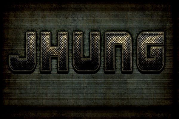
this one i had no guide and so my creativity had to be put to another challenge. at this point i was not sure i was getting better or texts are just easy to make than actually shapes. at any case i tried to imitate the same thing i did in the last project (Metallic Text). Close enough i guess....
at the start of this i really sucked but if you put at little into something then shit happens. then out at little more time, good shit happens until that shit becomes something great. i enjoyed this work really, i mean ... seriously this was fun :)
Friday, 26 April 2013
Text effect
Though this was the first work given to us, it was already tricky. for some reason i did not fully understand the use of using so many of those effects until the end result. it was F***ing awesome, i guess when you start off it does not seem like nothing happens, like with paintings and sketches. then you dont give up and keep trying you end up with something awesome. the best part is you feel awesome you made it.
to be honest sesond one is really mine, i dont have a home computer so i had not time to complete it, especially with blackouts. so i copied my friends and edited but i really wanted to try it so there... hope you enjoy it. again sorry.
http://psd.tutsplus.com/tutorials/text-effects-tutorials/mech-text-effect/
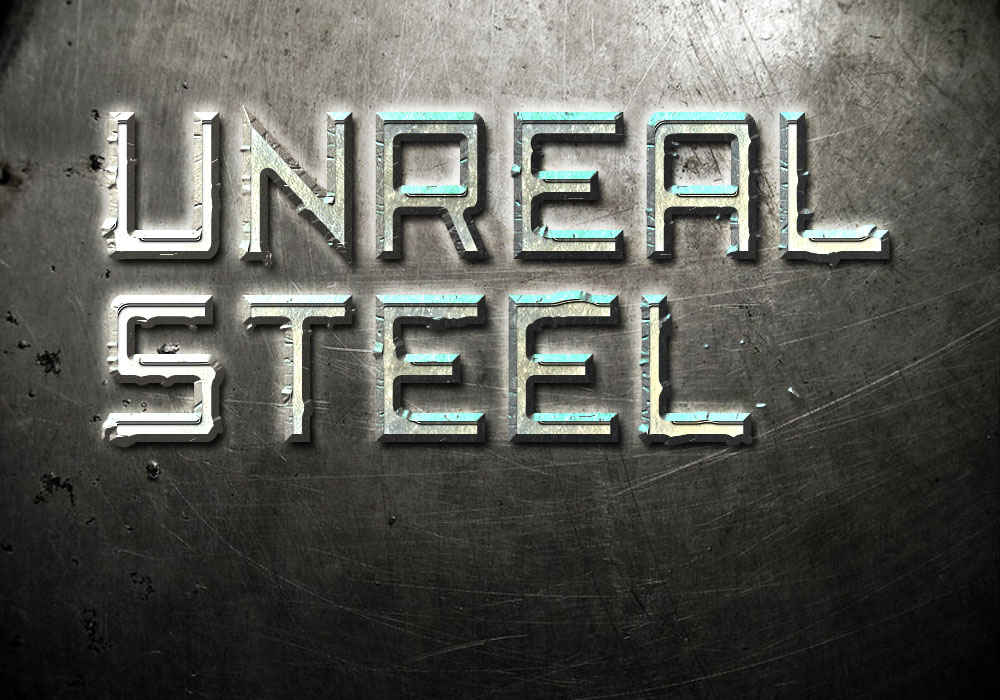
this one was just as awesome as the rest. though i did not notice these were all metallic text until now( Mind Blown!). i personally enjoyed trying to make the metal shine with colors ranging from white to lighter blue. also i enjoyed the making of dents on the metal text. gaze upon that steel shine!
Fun Fact: Steel isn't metal, its an alloy.
http://psd.tutsplus.com/tutorials/text-effects-tutorials/steel-text-effect/
Wednesday, 17 April 2013
Multimedia assignment
Multimedia has always been about giving information for the masses. In the pasts multimedia was understood as news for people. It was all newspapers, mails, sign boards, radio,advertising posters etc. Nowadays information can be transfered more easily like with the greatest thing made by man kind, the INTERNET(yeah!Over reaction). this one thing made the transfer of information more accessible and available, people could reach, everywhere and anywhere. these days people can chat with their relatives aboard or can look for direct information without reading an entire book for it, like looking "how to blog?" ( No "Idiot's Guide" for me). With the internet, multimedia has made a can now be accessible to the entire world.
This makes things good for people like me. As an IT student multimedia is the core to my course(that makes me "us"). Information Technology is the definition of the acronym, which means I use technology in sharing Information( Thank you Captain Obvious). But the reason i took this course was to understand programming video games( Did i pick the right course?), then again with learn who multimedia works can help with the promotion of the videos games i will make. just wait and see the video promotion will be epic but the g
ame... i will leave that to the people. in any case i still lots to learn in understand multimedia but so far this is all i got. hope you liked it( or not i really don't care, unless its my grade then i do care).
IT ON A DAILY BASIS |
MULTIMEDIA |
Tuesday, 16 April 2013
Subscribe to:
Posts (Atom)